Studio product shot on a clean set (e-commerce)
A Midjourney recipe for conversion-ready product photography — with the color science, lighting ratios, and shadow psychology that separate catalog filler from images that sell.
Result proof
Proof recommended · Generated image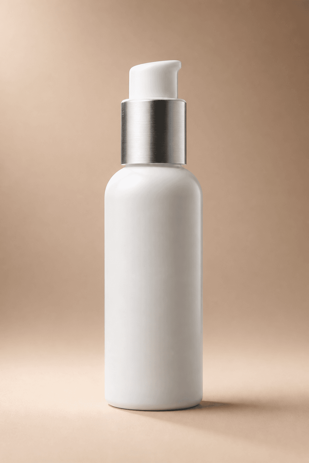
Generated e-commerce product proof
GPT Image 2 low-cost sample generated from the seed prompt's studio product photography recipe.
Prompt
professional studio product photograph of [PRODUCT], centered on a smooth [BACKDROP COLOR — see guide below] seamless backdrop, three-point commercial lighting — large softbox key from upper left at 4× intensity, fill from right at 2×, subtle rim/hair light from behind at 1× for edge separation — gentle [SHADOW TYPE — see guide] grounding the product, shallow depth of field f/2.8, shot on 100mm macro lens, crisp focus on product details, true-to-life color, clean and minimal, high-end e-commerce catalog aesthetic --ar 4:5 --style raw --stylize 150

Backdrop color science — choose intentionally, don't default to white:
• Warm beige/sand → reads as 'premium lifestyle' (skincare, home goods, food). Complements warm-toned products.
• Cool light grey → reads as 'tech/precision' (electronics, tools, SaaS). Complements cool-toned products.
• Deep charcoal/black → reads as 'luxury/dramatic' (watches, spirits, jewelry). Best with metallic or light-colored products for contrast.
• KEY RULE: backdrop should COMPLEMENT, not match. A brown product on beige disappears. A silver product on grey dies. Create tonal contrast.

Shadow type guide — each tells a different story:
• `contact shadow` = product feels grounded, real, sitting on a surface. Best for everyday/accessible products.
• `soft drop shadow` = product feels slightly elevated, polished. Best for premium positioning.
• `hard directional shadow` = dramatic, editorial. Best for fashion/luxury.
• `no shadow, floating on solid color` = clinical packshot, pure product focus. Best for catalog/comparison pages.

Lighting ratio: the prompt uses a 4:2:1 key-fill-rim ratio, which is the commercial photography standard. For flatter/softer looks (beauty, food), try 2:1:0.5. For dramatic/moody (spirits, tech), try 8:1:2.

Tips: name ONE surface + ONE backdrop color for consistency across a catalog. Add `reflective surface` for a glossy tabletop look. Keep `--stylize` at 100–200 so the product stays accurate — higher values add artistic interpretation that distorts product truth. Generate 4 variations, upscale the one with the cleanest shadow and truest color. For hero images, try `--ar 16:9`; for product cards, `--ar 1:1`.
- Source
- promptfork seed
- License
- CC-BY-4.0
- Published
- 6/23/2026